Zara Changed Its Logo & The Internet Has FEELINGS

In theory, change is a fact of life and it’s supposed to be good. That’s often what we tell ourselves to cope with its inevitability. But it can be challenging to adjust — since change strips away comfort zones and what’s new can be scary. Zara changed its logo and fast fashion fans and customers have feelings about it. They are having an admittedly hard time accepting it.
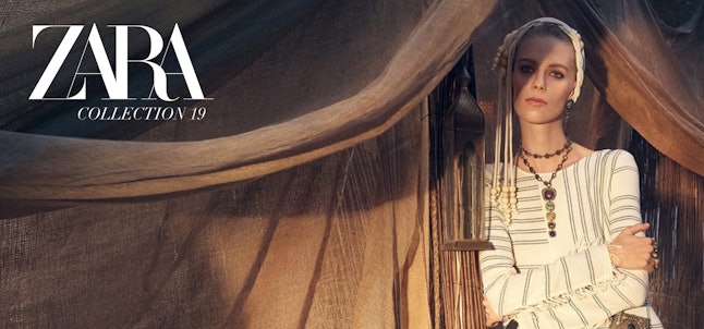
The brand swapped out the familiar, neat, and evenly spaced letters for ones that bump into each other in its name logo — the Z is all squashed up against the A and the R and the other A do the same. It’s a bit too close for comfort, according to the Internet. Most of the internet isn’t having any of this new logo. Twitter feels that it’s just too cramped and too curved for its own good. In fact, fans are pretty much rejecting it outright.
Will this web reaction cause Zara to pull a "New Coke" and replace the new logo with the classic, customer-preferred, and more minimalist version? That’s a reference to what’s considered one of the biggest marketing flops of all time — when Coke swapped out its signature beverage and reformulated it into a different-tasting one in 1985. No one liked New Coke and the beverage brand returned to the classic version.
Here’s the former logo.
And here’s the new one. As TODAY reports, the new Zara logo is the brand’s first redesign since 2010 and is only the second time the logo has been tampered with in the retailer’s 45-year history.
The reactions to the new Zara logo, created by the Baron & Baron design firm, are both intense and humorous. Customers are weighing in about how the design and the font look aesthetically and how that ultimately makes them feel. Here are some of the best tweets addressing the change. The general consensus is that the logo is too constricting to the point of being illegible. Zaba anyone? It also feels like a case of "If it ain’t broke, don’t fix it."
It is not very spacious and this could be the trajectory, for sure.
Some users compared it to the also-unpopular Slack app logo redesign.
Twitter seriously can’t handle this change.
I mean, it is in all caps… which is how you express yelling via a keyboard and in the digital space.
This user also has a salient point. It is a bit confusing and hard to read.
It surely elicits a lot of feelings for being a logo.
This perception is also pretty spot on. Is this Zara’s response to the polar vortex gripping the nation?
That’s how my fashion and beauty-focused mind thinks. It’s not too dissimilar to the way the letters of the NARS logo are intertwined.
Zara has yet to address the reaction to the logo change. Bustle reached out to the brand for comment while the Twitter responses rage on.
Source: Read Full Article

